
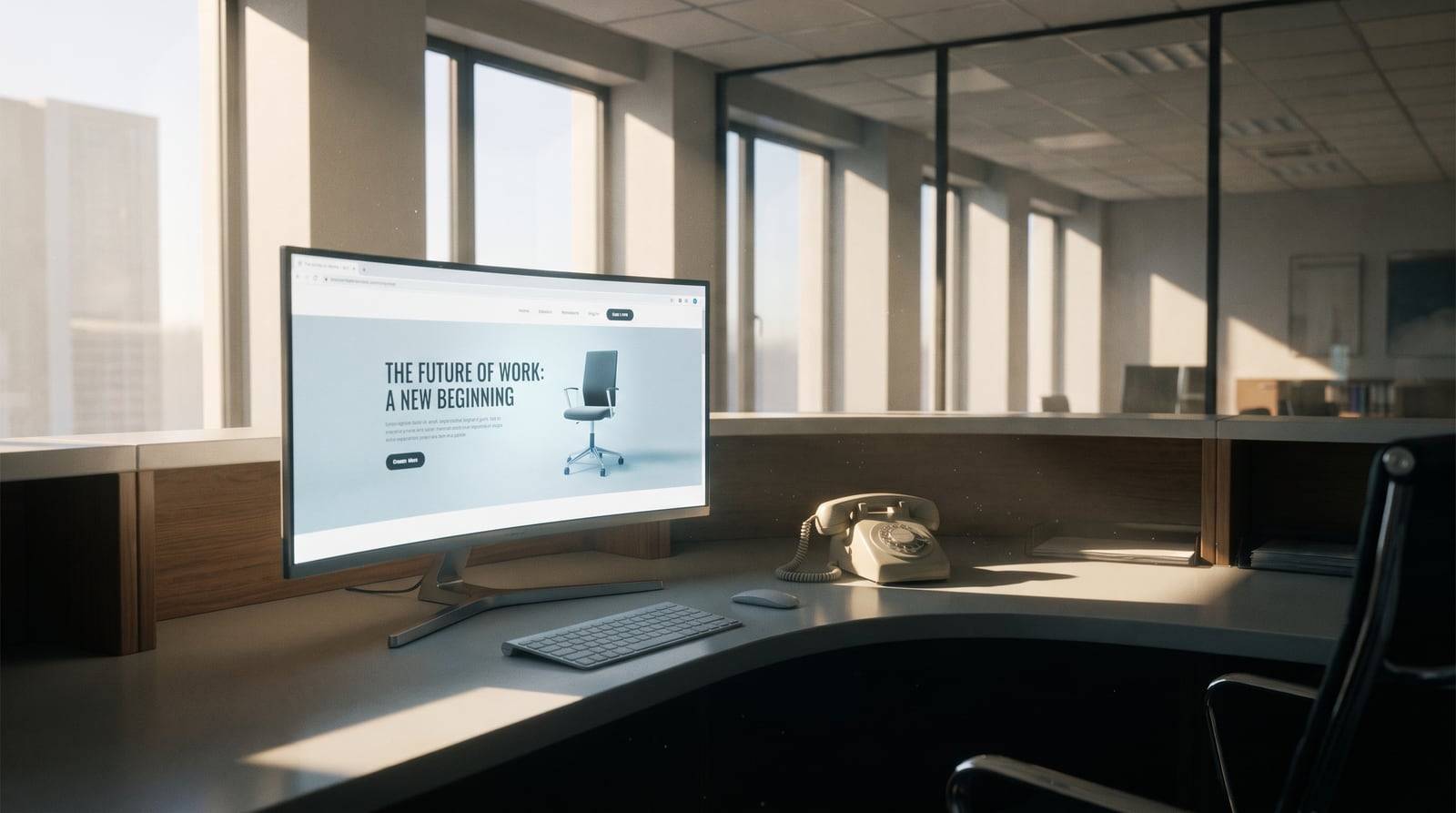
A good-looking website won't bring in customers by itself. Looks don't make people act. Conversion comes from clear messaging, an obvious next step, fast load times, and SEO that brings the right traffic. Combine good design with conversion strategy and search visibility, then measure results — not compliments.
You spent months on the redesign. The colours are perfect, the animations are smooth, the photography is sharp. Everyone who sees it says "wow." Yet the phone isn't ringing and the contact form stays empty. If that sounds familiar, you've hit an uncomfortable truth: a pretty website does not automatically improve your website conversion. Looks get compliments. Strategy gets customers.
This isn't an argument against good design. It's an argument against treating design as the finish line when it's really just one piece. Let's look at why beautiful sites fail to sell, and what separates a digital brochure from a machine that generates leads.
Pretty Is Not the Same as Persuasive
Design makes people feel something. Persuasion makes people do something. The two are related, but they aren't the same skill, and most redesigns pour effort into the first while barely touching the second.
A site can look stunning and still fail every basic job a business website has to do:
- It doesn't tell visitors what you actually sell in the first five seconds.
- It buries the thing you most want people to do inside a tasteful, easy-to-miss menu.
- It talks about you — your heritage, your passion, your values — instead of the visitor's problem.
- It loads slowly because of the very assets that make it look good.
None of these are aesthetic flaws. They're conversion flaws. And conversion flaws cost you money.
Here's the sneaky part. When friends, staff and clients praise a new site, that praise feels like proof it works. But people compliment design, not conversion rates. Nobody emails to say "your call-to-action placement increased my intent to buy by 12%." So owners mistake applause for performance and never ask whether the site is doing its job.
What Actually Drives Website Conversion
Website conversion is the percentage of visitors who take the action you care about — booking a call, requesting a quote, buying, subscribing. Improving it comes down to clarity and friction, not beauty.
Three things move the needle more than any colour palette:
Message clarity. Within seconds a visitor should understand what you do, who it's for, and why it's better. Confusion kills conversion faster than anything else.
- A single obvious next step. Every page should guide toward one primary action. Offer ten equal options and people choose none.
- Reduced friction. Short forms, fast load times, no surprise logins, no dead ends. Every extra click or field leaks prospects.
- None of these need expensive visuals. A plain page with a sharp headline and one clear button will out-convert a cinematic hero section that leaves people guessing.
Where you place a button, how you phrase a headline, what order you present information — these are structural choices. They're baked into the wireframe long before anyone picks fonts. Skip conversion at the layout stage and no amount of polish later can rescue it.
No Traffic, No Conversions: The SEO Problem
Even a perfectly persuasive page converts nobody if nobody sees it. This is where the most beautiful sites quietly fail: they're invisible in search.
Treating web design and SEO as separate phases — design first, "we'll do SEO later" — almost guarantees weak results. How a site is built directly affects whether it can rank:
Heavy image sliders and bloated scripts slow the site, and speed is a ranking factor.
Text baked into graphics can't be read by search engines.
- Fancy single-page scroll layouts often leave you with one URL and nothing to rank for specific searches.
- Missing headings, alt text and structured data strip out the signals Google relies on.
- Plan design and SEO together and you get a site that looks good and gets found. Plan them apart and you get a gorgeous destination with no road leading to it.
- Priority
Design-only site
| Design + SEO + conversion | Gets found in search | Rarely |
|---|---|---|
| Consistently | Load speed | Often poor |
| Optimised | Clear next step | Accidental |
| Intentional | Generates leads | Occasionally |
| Reliably | Looks good | Yes |
| Yes | That last row matters: you don't have to choose between beautiful and effective. You just have to refuse to settle for beautiful alone. | From Brochure to Lead Generation Website |
Most small-business sites are digital brochures. They exist, they describe the company, and they sit there. A lead generation website is different — it's built to actively capture interest and move people toward becoming customers.
The shift is less about technology and more about intent. Ask of every page: what should a visitor do next, and how am I making that easy?
The building blocks of a lead-generating site
Clear value proposition above the fold so visitors instantly know they're in the right place.
Relevant calls to action repeated at natural decision points, not just once in the footer.
- Lead magnets — a guide, a quote tool, a free consultation — that give people a low-commitment reason to raise their hand.
- Social proof placed near the action: reviews, logos, case studies, numbers.
- Short, trustworthy forms that ask only for what you genuinely need right now.
- Landing pages built around specific services or campaigns rather than forcing all traffic to the homepage.
- Each element exists to nudge a visitor one step closer to contacting you. A brochure describes; a lead generation website converts.
- The Measurement Gap
Here's a question that exposes most redesigns: how will you know if the new site is working?
If the answer is "it looks more modern," you have no way to tell success from failure. A results-focused site is instrumented from day one:
Analytics tracking which pages people land on and leave from.
Conversion goals for forms, calls and bookings.
- Heatmaps or recordings to see where attention and confusion cluster.
- A/B tests on headlines and calls to action.
- Without measurement, improving website conversion is guesswork. With it, you can see exactly where visitors drop off and fix that specific leak — turning a static site into something that gets better over time.
- What good metrics look like
Don't fixate on vanity numbers like raw pageviews. Watch:
Conversion rate — visitors who take your key action.
Cost per lead — what you pay to acquire an enquiry.
- Bounce rate on key pages — early warning of mismatch or confusion.
- Time to first action — how quickly people engage.
- These tell a business story. "It looks great" does not.
- Why This Happens (and How to Avoid It)
Pretty-but-useless sites don't come from bad intentions. They come from how projects are scoped. The brief says "make it look amazing," the designer delivers exactly that, and nobody owns the harder questions about traffic and conversion.
To dodge the trap, build the right priorities into your project from the start:
Lead with strategy. Before mockups, define your target customer, the action you want, and the keywords they search.
Hire for the full stack of skills. Make sure someone on the project genuinely understands web design and SEO together, not just one in isolation.
- Write for the visitor, not the mirror. Copy should answer "what's in it for me?" before it tells your origin story.
- Plan the funnel, not just the pages. Map how a stranger becomes a lead becomes a customer.
- Set a performance target. Agree upfront what the site must achieve, in numbers, within ninety days.
- Do these and good design becomes an asset that amplifies results rather than a distraction that masks their absence.
- The Bottom Line for Owners
There's nothing wrong with wanting a beautiful website. You should. First impressions matter, trust is visual, and a dated site can actively repel customers. But beauty is table stakes, not a strategy.
The sites that grow businesses combine three things: a design people trust, SEO that brings the right people in, and conversion thinking that turns those people into enquiries. Drop any one and the whole thing underperforms.
So as you plan your new or redesigned site, resist judging success by how it looks on launch day. Judge it by what it does three months later: the leads in your inbox, the calls on your calendar, the customers you can trace back to it. That's the only review that pays the bills.
Make it pretty — then make it work.
So as you plan your new or redesigned site, resist the urge to judge success by how it looks on launch day. Judge it by what it does three months later: the leads in your inbox, the calls on your calendar, the customers you can trace back to it. That's the only review that pays the bills.
Make it pretty — then make it work.